


 PhantomDeejay
Have you ever wondered what kind of skin "skinners" use for their own gigs ?
Most people should know already that personally I create skins only for my own usage and then I just enhance with what other people may need before I upload them for everyone to use if they like. So you would expect me to use SilverSleek #3 !!! :)
Well, while that's true, I recently got faced with a challenge: To gig on a small 12 inch monitor!
Personally I never gig on a monitor lower than 19 inch, and I realized that the bigger advantage of SilverSleek #3 was it's greatest disadvantage at the same time.
SilverSleek #3 was designed on 19, 23 and 32 inch monitors. It's primary goal was to fit as many usable controls in as much less space possible in order to leave plenty of room for the browser.
While this logic works well on large monitors, it does not work that well (dare I say at all) on small ones!
Therefore the need of a "new" skin was born: It started out as a "stripped" version of SilverSleek #3 in order to fit on small monitors, but after a while it got it's own personality. It was then redesigned from scratch on a 12 inch monitor, then sized up to 23 inch, then sized down again e.t.c. until the key balance between size of elements, number of elements, positioning and global dimensions was found.
This new skin is going to be the first skin I will name after my nickname. It's still under development, but I thought it would worth sharing a preview/teaser with you.
Since it's tailored to my own current needs you should not expect to see the versatility of SilverSleek 2 and 3 skins. Instead it's plain simple with a lot of "smart" features hidden here and there to make it powerful enough to compete SilverSleek series skins.
Enough with the talking, don't you agree ?
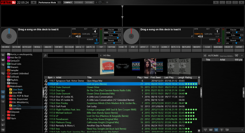
Performance Mode - Compact View
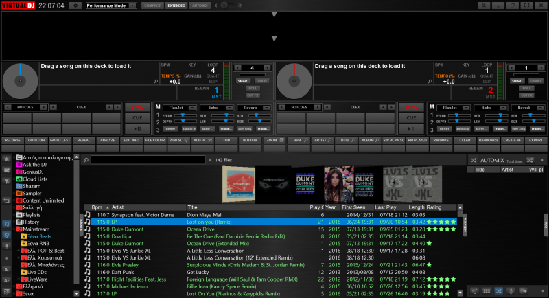
Performance Mode - Extended View

Performance Mode - Automix View
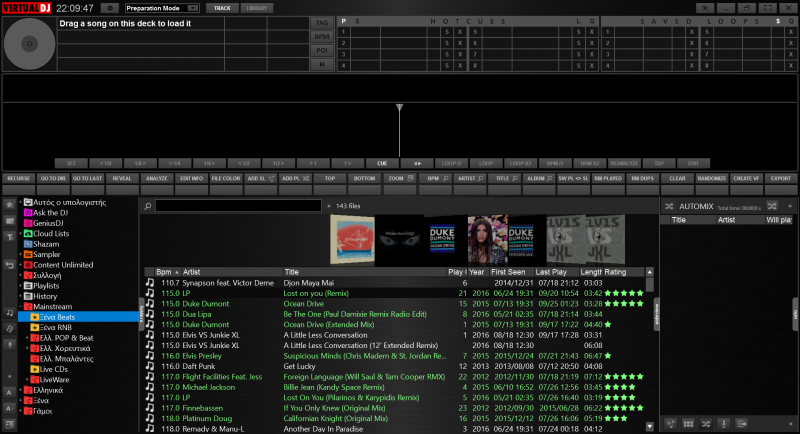
Preparation Mode - Track
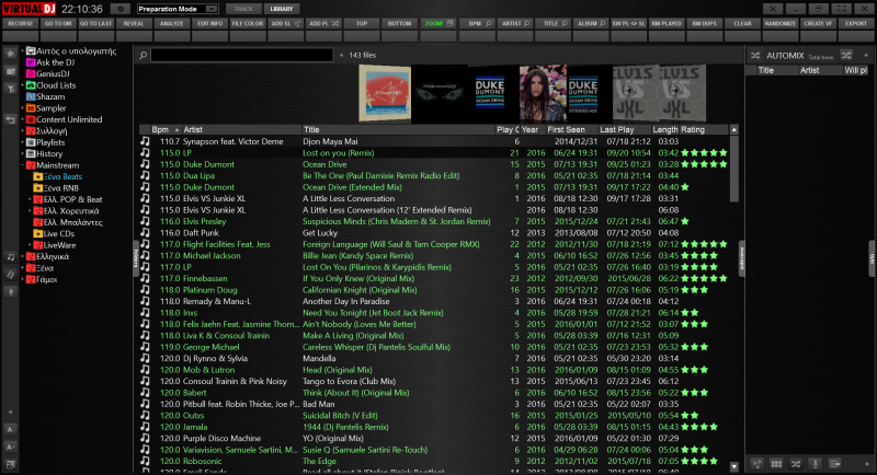
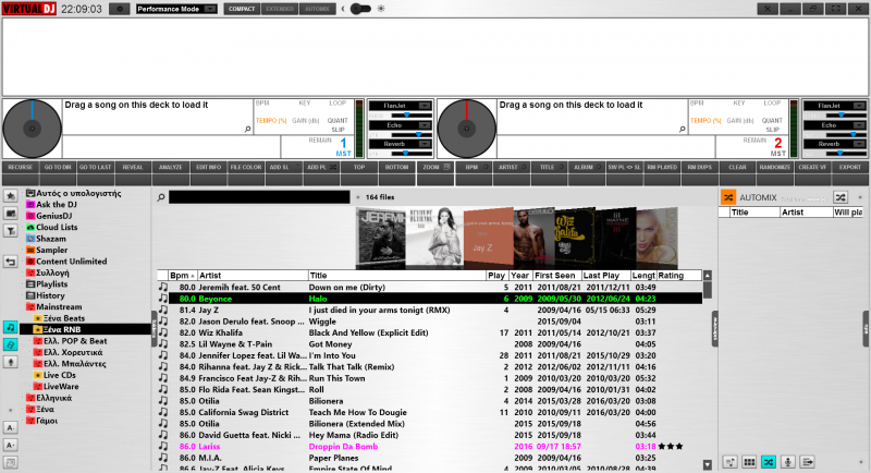
Preparation Mode - Library
Daylight View (Performance mode only)
Most people should know already that personally I create skins only for my own usage and then I just enhance with what other people may need before I upload them for everyone to use if they like. So you would expect me to use SilverSleek #3 !!! :)
Well, while that's true, I recently got faced with a challenge: To gig on a small 12 inch monitor!
Personally I never gig on a monitor lower than 19 inch, and I realized that the bigger advantage of SilverSleek #3 was it's greatest disadvantage at the same time.
SilverSleek #3 was designed on 19, 23 and 32 inch monitors. It's primary goal was to fit as many usable controls in as much less space possible in order to leave plenty of room for the browser.
While this logic works well on large monitors, it does not work that well (dare I say at all) on small ones!
Therefore the need of a "new" skin was born: It started out as a "stripped" version of SilverSleek #3 in order to fit on small monitors, but after a while it got it's own personality. It was then redesigned from scratch on a 12 inch monitor, then sized up to 23 inch, then sized down again e.t.c. until the key balance between size of elements, number of elements, positioning and global dimensions was found.
This new skin is going to be the first skin I will name after my nickname. It's still under development, but I thought it would worth sharing a preview/teaser with you.
Since it's tailored to my own current needs you should not expect to see the versatility of SilverSleek 2 and 3 skins. Instead it's plain simple with a lot of "smart" features hidden here and there to make it powerful enough to compete SilverSleek series skins.
Enough with the talking, don't you agree ?
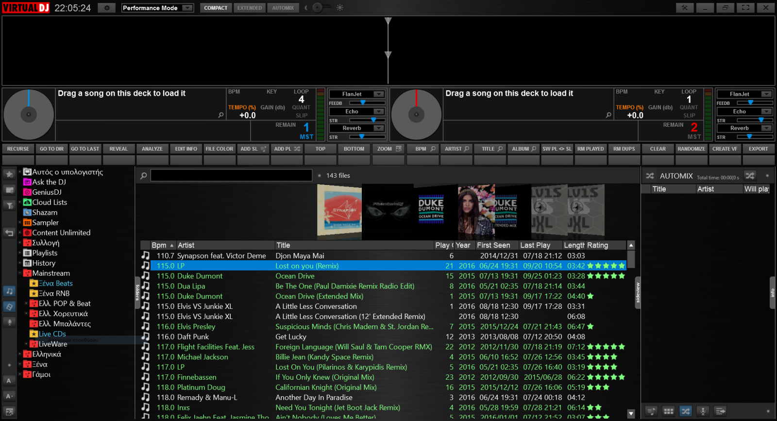
Performance Mode - Compact View
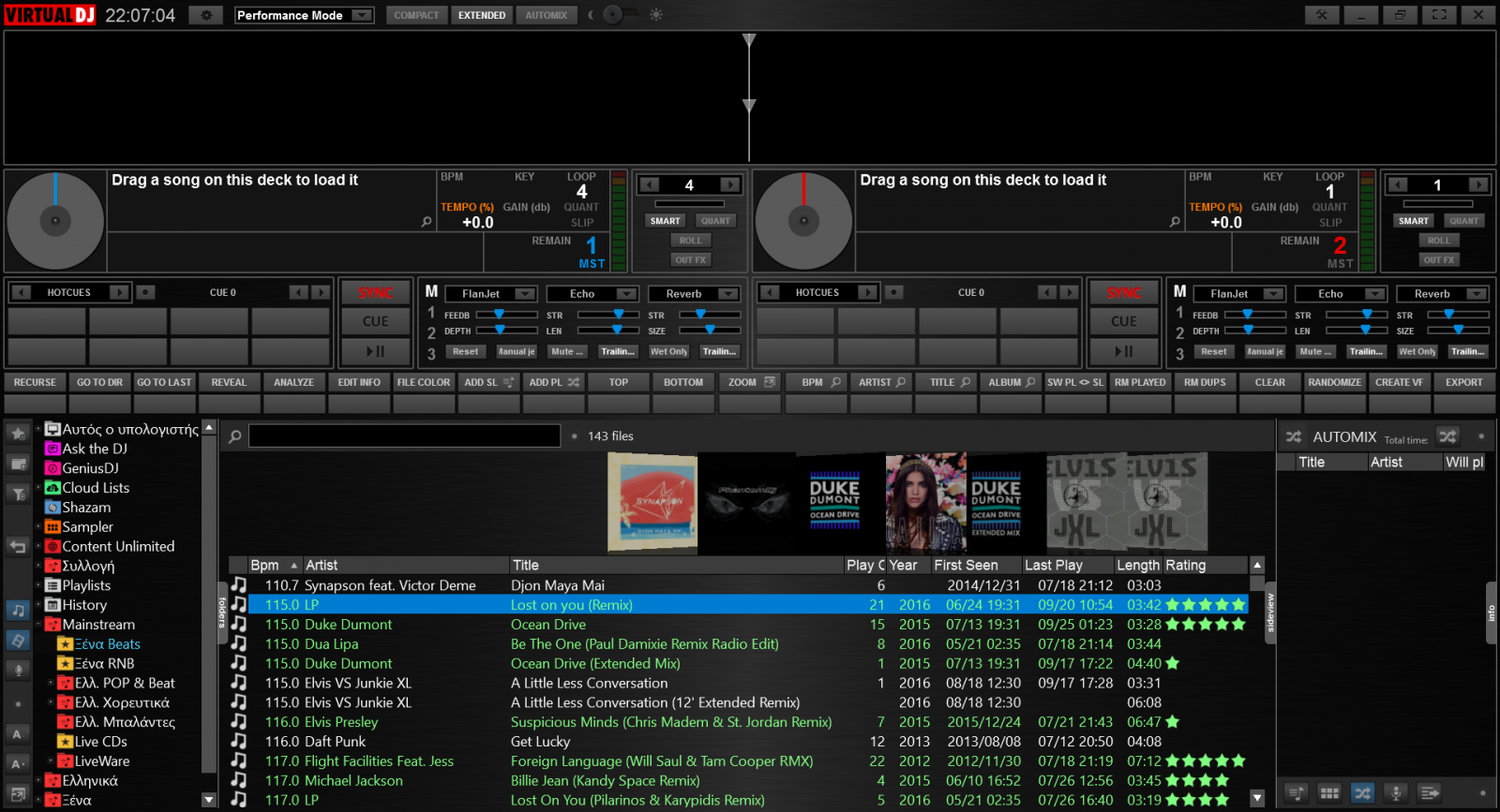
Performance Mode - Extended View
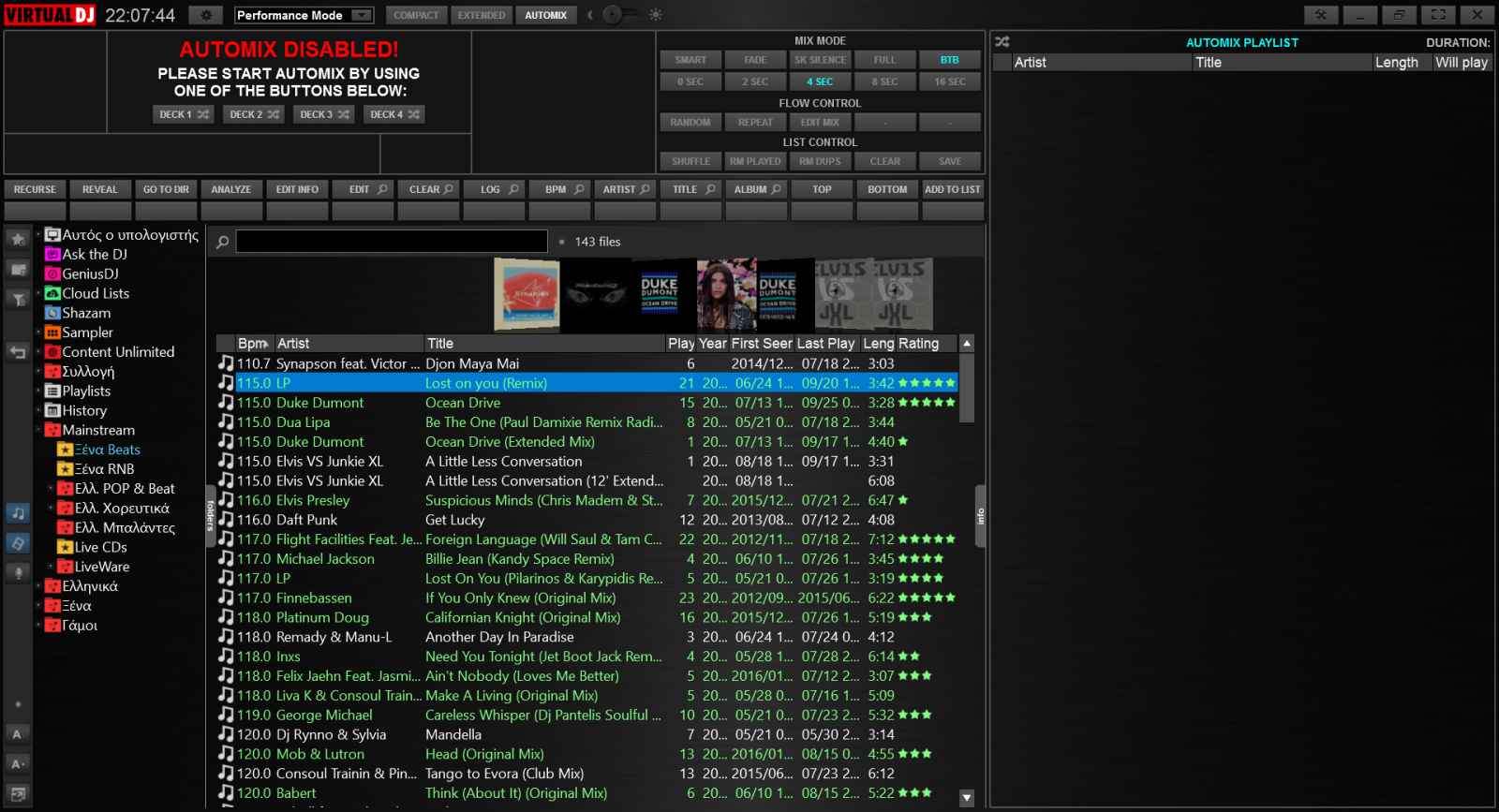
Performance Mode - Automix View
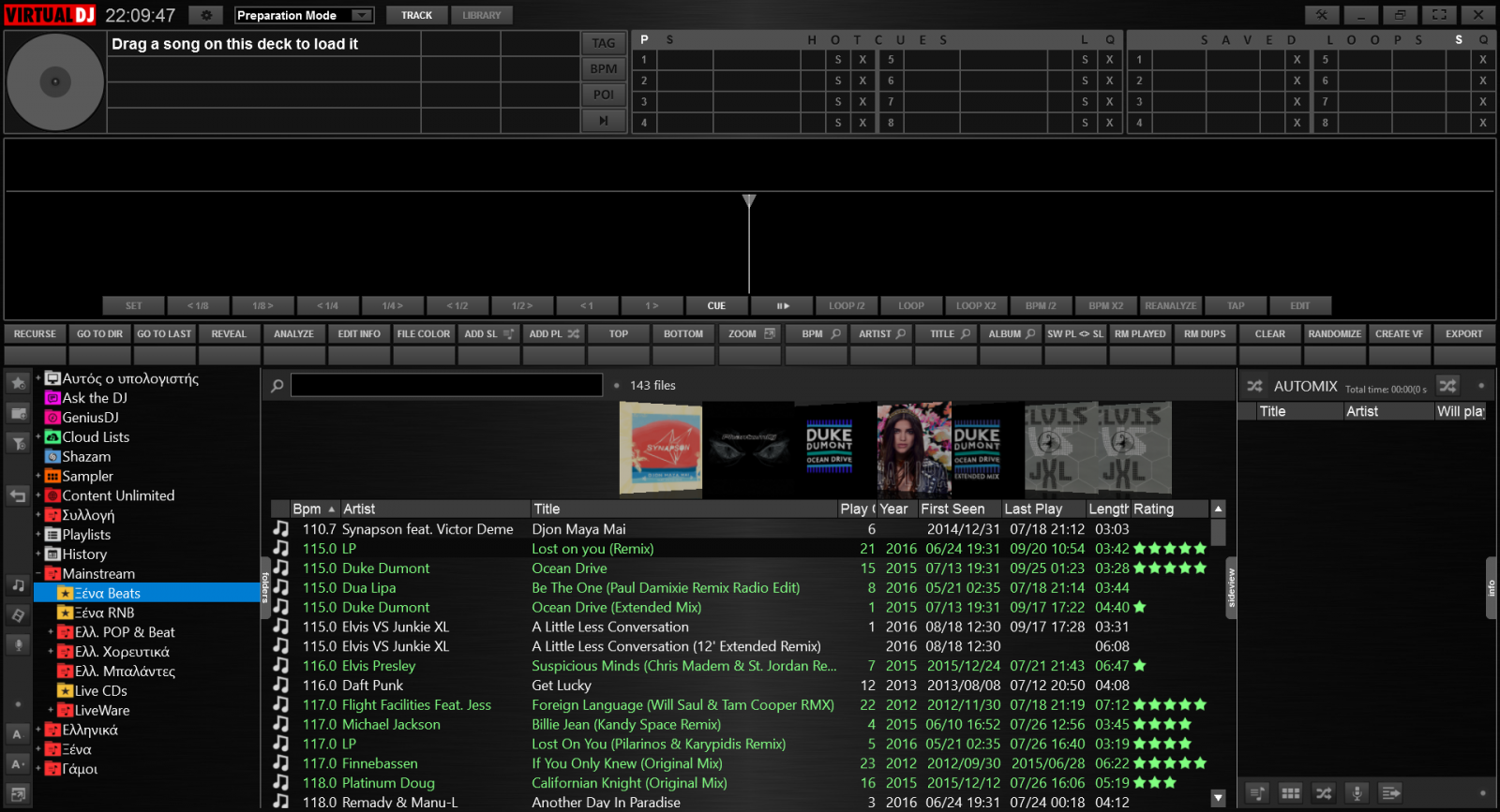
Preparation Mode - Track

Preparation Mode - Library

Daylight View (Performance mode only)
Posted Mon 26 Sep 16 @ 8:07 pm
PhantomDeejay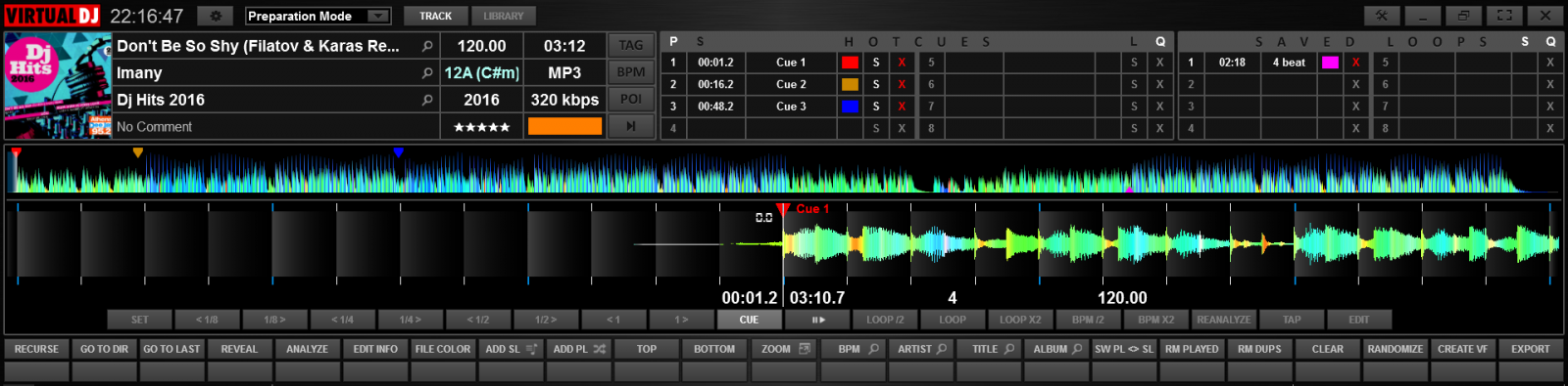
Track Preparation Overview
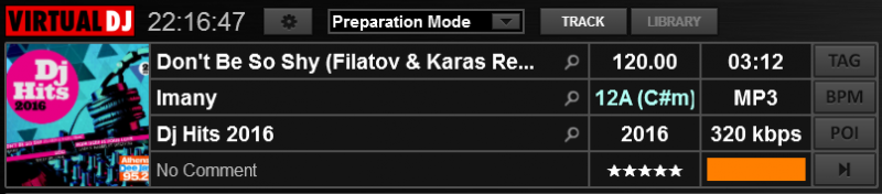
Track Info
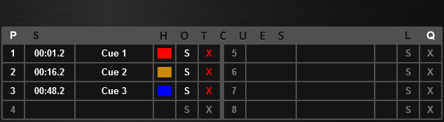
HotCues
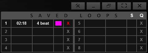
Saved Loops
Posted Mon 26 Sep 16 @ 8:19 pm
PhantomDeejay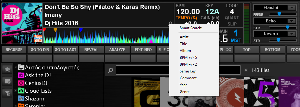
Bonus Image from Performance mode
Posted Mon 26 Sep 16 @ 8:22 pm
 kradcliffe
Totally agree George. I really like SilverSleek 3 however I use two machines for my gigs, one with a 13.3 inch dispaly and another with 12.5 inch display and parts of it are unreadable.
Be interesting to see how this pans out.
I had several skins previous to V8 that were perfect for me as they were lower resolution and could be sized up to suit, however V8 hasn't worked out very well. I fully understand the decision to make all skins at 1920x1080 and the theory was good if all the elements could be scaled however this hasn't turned out to be the case and many V8 skins are not good to read on sub 15" monitors.
It's good to see someone has recognised this at last!
Posted Mon 26 Sep 16 @ 8:23 pm
PhantomDeejay
It has nothing to do with resolution. It has to do with the sizing of the elements.
This skin is still 1920x1080
But it scales nice down to 1366x768 on a 12 inch monitor because the size of the elements has been calculated in such a way that it looks as if it was native to that screen resolution.
The only draw back is that some elements look bigger than they should be on monitors greater than 19 inch. But that's only if you have get used working with skins like SilverSleek :P
As an example: The 3 lines of info for the decks look perfect on 12 inch. However on 23 inch the size of the text is bigger than necessary. Your brain says you that on this space you could fit 4 lines with smaller font size. But your brain will complain only if you have get used working on a 23 inch monitor with smaller fonts (like SilverSleek does)
Posted Mon 26 Sep 16 @ 8:33 pm
kradcliffe
That's what I'm trying to say above.
Posted Mon 26 Sep 16 @ 8:46 pm
 locoDog
I was indeed wondering...
I like the look of prep mode, super long pos wave, most of the space dedicated to cue & loop info.
I don't think performance mode is for me though, I need to see the mixer as I clone decks and the eq and the gate fader so my controller isn't always showing what is actually happening. There are some things I like though, no pitch fader, just a %
It looks just the thing if you're running a netbook as a backup
Posted Mon 26 Sep 16 @ 8:58 pm
 the SOUND INSURGENT
Please, please, please add that Perp mode to SliverSleek 3!!
I can't tell you how many times I've sat there and wished for that.
Other then that, looks like another awesome creation!!
I can't tell you how many times I've sat there and wished for that.
Other then that, looks like another awesome creation!!
Posted Mon 26 Sep 16 @ 9:17 pm
PhantomDeejay
Your eye (or should I say your brain) compensates different size proportions in different ways.
Even with vector graphics, you can't design something that will look "perfect" on any size. You have to compromise.
It mostly has to do with the distance at which you're looking an object, versus the object's dimensions.
I design Survey Maps very often, as that's what I studied for. Without knowing the final print scale of a map you can't really design the map elements even on a "dimensionless" digital environment. The smaller the print scale is going to be, the less elements you need to draw (or the design will be too busy and hard to read) and the bigger the text size you need to use and vice versa.
Text is something very tricky on maps and GUI's. While your brain compensates easier other element size changes, for the text it has get used to some "fixed" standard sizes depending on the size of the "frame" that the text belongs too.
I'm not a native English speaker and I can't use the right wording, but let's say that while your brain can accept changes on various graphic elements to a 1 by 1 ratio, text needs to follow 1,33 to 1.
So, if you are about to double the size of a design (200%) it's text needs to be around 175% for your brain to compensate it properly.
Take a letter size printed page and go on a copy machine. Photocopy (enlarge) that letter size page to Ledger/Tabloid paper size. It's only 30% bigger.
Does the text look normal ? Doesn't it look too big ? Even while the paper space ("frame") and the text grow up by the same amount, the text looks bigger than it should be. Even if you increase the distance between your eyes and the paper. Text still doesn't look as "good" as it looked on the original.
Posted Mon 26 Sep 16 @ 9:25 pm
PhantomDeejaylocodog wrote :
I was indeed wondering...
There are some things I like though, no pitch fader, just a %
There are some things I like though, no pitch fader, just a %
Actually the pitch display offers two more functions:
1) It changes to red color when the controller's pitch fader does not match the software one
2) It's also a menu with options to reset pitch, lock pitch sliders or change the pitch range
Posted Mon 26 Sep 16 @ 9:33 pm
locoDogthe SOUND INSURGENT wrote :
Please, please, please add that Perp mode to SliverSleek 3
Hell why not have something similar on the default skin too?
Posted Mon 26 Sep 16 @ 9:44 pm
 wickedmix
nice hope it works well with a 10 inch touch screen tablet
Posted Mon 26 Sep 16 @ 9:58 pm
PhantomDeejay
Some of the functions of Preparation mode:
1) Track Title. Press the magnifying glass icon to search for tracks with the same title
2) Track Artist. Press the magnifying glass icon to search for tracks from the same artist
3) Track Album. Press the magnifying glass icon to search for tracks from the same album
4) Track Comment. Click on the field to edit the comment. Press the magnifying glass icon to search for tracks with the same comment
(On all these fields the search icon appears only if the corresponding field has data)
5) Track Rating. Click on the field to edit the rating
6) HotCues Mode (Play/Stutter)
7) Lock Cues
8) Quantize setting cues on CBG
9) Cue Name. Click on field to edit the cue name
10) Cue Color. Click on color to edit the color for the cue (9 pre-defined colors + clear)
11) Set (or update) Cue
12) Delete Cue
Posted Mon 26 Sep 16 @ 10:08 pm
the SOUND INSURGENTlocodog wrote :
Hell why not have something similar on the default skin too?
the SOUND INSURGENT wrote :
Please, please, please add that Perp mode to SliverSleek 3
Hell why not have something similar on the default skin too?
Because I don't use the default ;-p
The default skin is just not my cup of tea, I've used this program for a long time and I've never been able to use it. To many layers and for me the colors are terrible.
Anyways George is always killin when it comes to skins!!
Posted Mon 26 Sep 16 @ 10:08 pm
 groovindj
PhantomDeejay wrote :
Press the magnifying glass icon
Press the magnifying glass icon
Ever since experiencing this in Traktor, I've thought it should be part of the VDJ browser too. Useful stuff!
Posted Tue 27 Sep 16 @ 5:17 pm
locoDogthe SOUND INSURGENT wrote :
Because I don't use the default ;-p
locodog wrote :
Hell why not have something similar on the default skin too?
the SOUND INSURGENT wrote :
Please, please, please add that Perp mode to SliverSleek 3
Hell why not have something similar on the default skin too?
Because I don't use the default ;-p
No quite what I was meaning, [I meant as well as.]
If it was something like it as part of the default skin then it becomes the norm, thenskin creators will likely include something similar in their designs too.
A prep mode might well help me actually stick to the task of prepping tunes, instead of breaking off for a 4 hour mix.
Posted Tue 27 Sep 16 @ 5:27 pm
the SOUND INSURGENT
Yeah I feel ya on that. I try to prep tracks but usually ends up in a session with nothing accomplished, lmmfao!!
I'd love for this to be the norm but for now please add this to SliverSleek3 because that is the skin I use and don't plan on changing anytime soon ;-p
I'd love for this to be the norm but for now please add this to SliverSleek3 because that is the skin I use and don't plan on changing anytime soon ;-p
Posted Tue 27 Sep 16 @ 5:34 pm
groovindj
An ideal candidate for a popup window?
Take the prep mode part of this skin and add it to SS3. As the windows need separate PNG files, it shouldn't be as complex as adding it into the main SS3 PNG.
Take the prep mode part of this skin and add it to SS3. As the windows need separate PNG files, it shouldn't be as complex as adding it into the main SS3 PNG.
Posted Tue 27 Sep 16 @ 5:39 pm
the SOUND INSURGENT
Any updates oh great one ;-p
Posted Mon 10 Oct 16 @ 5:36 pm
 Sven DeKay
Video Mode ?!
Posted Fri 14 Oct 16 @ 7:40 pm