


Can i if not chagne me frgn nickname just delete the acount then ??!!
Posted Thu 31 Aug 17 @ 12:01 am
 groovindj
Who typed it in then? You should've been sensible in the first place!
As your account isn't tied to a license, just stop using it and create another one (with some thought behind it). :-)
As your account isn't tied to a license, just stop using it and create another one (with some thought behind it). :-)
Posted Thu 31 Aug 17 @ 5:39 pm
 kradcliffe
kradcliffe wrote :
The ability to expand a posted screenshot to full size when clicking on it.
Sure this has been asked for many times before.
Sure this has been asked for many times before.
Still not implememted.
Posted Tue 05 Sep 17 @ 8:18 pm
 PachN
PachN
Yes. Definitely helpfull.
Posted Wed 06 Sep 17 @ 10:13 am
kradcliffe
Are we ever going to get the ability to expand posted images?
this has been promised for ages now. Many screenshots are shrunk down to fit the page and are practically unreadable especially on the mobile view.
It's not easy to help people when you can't see the images they have posted properly.
Also still a bug when you post an image that is too large it will just not appear but post a blank entry. Can this be fixed too please?
Posted Mon 30 Oct 17 @ 2:53 pm
 Don Moir
You can right click an image in FF and select view image to see either the normal size or at least a larger size. I think it was hard resized before but not sure.
Posted Thu 02 Nov 17 @ 10:08 pm
 Stretchincanada
i wish all addons came with a link to a youtube video so i can see how new stuff works.
Posted Thu 16 Nov 17 @ 8:00 pm
 djles.co.uk
I read these forums every day and constantly see users asking for help but failing to give information about their setup. A culture of adding a signature to each users profile containing details of their system could reduce the need to keep asking for the information. Even stating Mac or PC would be better than nothing. Limiting it to say 255 characters would also keep it sensible.
Cheers
Les
Mid 2010 MBP i7, High Sierra, 512gb SSD bootcamped with Windows 7 64bit, external 2Tb HD containing Music, Video & Karaoke databases.
Cheers
Les
Mid 2010 MBP i7, High Sierra, 512gb SSD bootcamped with Windows 7 64bit, external 2Tb HD containing Music, Video & Karaoke databases.
Posted Thu 23 Nov 17 @ 7:44 am
kradcliffe
Problem I see on other tech forums is that people don't keep their profiles up to date.
Also I personally have two laptops, three controllers and various setups within them so it wouldn't work for everyone.
Also I personally have two laptops, three controllers and various setups within them so it wouldn't work for everyone.
Posted Thu 23 Nov 17 @ 7:48 am
djles.co.uk
Fair do's, just constantly seeing users asking for help and not providing enough info for others to be able to give them help.
Posted Thu 23 Nov 17 @ 9:54 am
 music234
On my hp:
Delete played sets on block.
Or did I missed something?
Delete played sets on block.
Or did I missed something?
Posted Tue 12 Dec 17 @ 9:30 pm
groovindj
When using the search box to look for posts containing a particular word or phrase, the results don't seem to come back in any kind of order.
Why not? Can we please have results sorted by date (most recent posts first)?
Why not? Can we please have results sorted by date (most recent posts first)?
Posted Sun 14 Jan 18 @ 10:02 am
 geemix
synthet1c wrote :
can you add a mac and pc logo to people's avatar description that is selectable in the "Modify My Profile" page... It would make it easier to tailor responses more specifically to someone's operating system with that extra little bit of information.
Now why did they not think of that before :)
Posted Sun 21 Jan 18 @ 10:38 am
PachN
It wasn't necessary before. There were separate WIN and MAC technical support forums. But since they got consolidated such an info sometimes can be helpfull.
Or... the user seeking help just provides usefull infos in the first place.
Or... the user seeking help just provides usefull infos in the first place.
Posted Sun 21 Jan 18 @ 12:07 pm
 klausmogensen
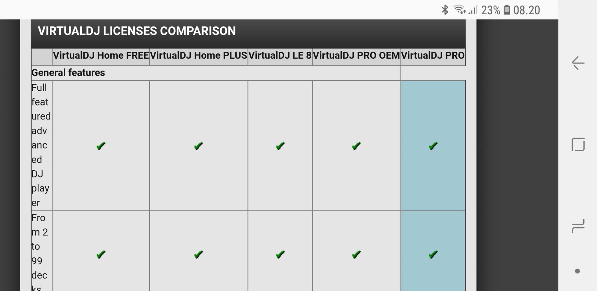
A new version af the comparison chart for mobile phones would be great. It's a bit hard to read at the moment:
Posted Wed 28 Mar 18 @ 6:23 am
groovindj
The site as a whole is not very user friendly on a smartphone. Navigation needs to be easier.
Clicking on a hyperlink displayed as text in a thread

is fine when using a mouse, but on a phone with your finger it's a nightmare.
Clicking on a hyperlink displayed as text in a thread
is fine when using a mouse, but on a phone with your finger it's a nightmare.
Posted Wed 28 Mar 18 @ 5:31 pm
I lost earlier sets from my history, due to a failed laptop.
If there was a way to download-import my earlier played sets from my VDJ online account.
A download function like a "download to m3u file" , that would be great....
If there was a way to download-import my earlier played sets from my VDJ online account.
A download function like a "download to m3u file" , that would be great....
Posted Wed 04 Apr 18 @ 1:17 am
 OceanBob
Quoting would be easier if you could select a part of a comment with the left part of the mouse , then right-click on the selected text , and see the word 'quote' , and then left-click 'quote' . That must be easier then quoting a whole comment and then having to remove parts . A lot of forums work this way.
Posted Mon 16 Apr 18 @ 8:14 am
groovindj
Please make the forum more "responsive" i.e. easier to use on smartphones.
At the moment, navigating between the various forum areas on a phone screen is extremely difficult because of the "thread display" to the top right hand side, which is far too small for touching accurately with a finger.
Also certain forum areas just do not display correctly on a phone screen - such as the feature comparison chart.
Posted Thu 21 Jun 18 @ 6:39 pm
PachN
If a post or thread is not your level can it please not be displayed on the forum overview?
I just keep clicking on that forum and can't see anything -_-

I just keep clicking on that forum and can't see anything -_-
Posted Fri 13 Jul 18 @ 8:35 am