groovindj wrote :
With more panels open, the browser gets progressively smaller - but beyond a certain point, the browser icons (left hand side) start piling up on each other. ...
Would it not be better for this skin design type (panels making the browser smaller) to put the icons along the top edge of the browser where they won't become squashed? .
Would it not be better for this skin design type (panels making the browser smaller) to put the icons along the top edge of the browser where they won't become squashed? .
Well, while this appears to be a reasonable solution, i really don't think the problem is actually the Toolbar. and its overlapping buttons. The Browser height is too limited to work with if you have all panels displayed. Some of the available panels will be opened to adjust or look at something and then close again. I dont expect users to have all of them opened and trying to work with such a small browser.
Posted Sun 19 May 19 @ 5:40 pm
djdad wrote :
Fixed now, please re-download
locodog wrote :
TC or Mic button......
Fixed now, please re-download
Yep fixed,
Custom button rack still not perfect
try just fx & sampler & mini video racks
Posted Sun 19 May 19 @ 5:50 pm
djdad wrote :
i really don't think the problem is actually the Toolbar. and its overlapping buttons
But it shouldn't happen, surely? And indeed it doesn't on the previous version of the skin. The icons simply resize and remain separated from each other.
It also doesn't happen when run on my laptop (32 bit Windows 8.1). It only happens on my main tower PC (Windows 10 64 bit) on both 32 and 64 bit versions of VDJ.
Posted Sun 19 May 19 @ 6:09 pm
locodog wrote :
I thought i had measured positions correctly in all possible combinations, but seems i missed another one lol... Fixed in 2.03Custom button rack still not perfect
try just fx & sampler & mini video racks
try just fx & sampler & mini video racks
Posted Sun 19 May 19 @ 6:16 pm
groovindj wrote :
But it shouldn't happen, surely? And indeed it doesn't on the previous version of the skin. The icons simply resize and remain separated from each other.
It also doesn't happen when run on my laptop (32 bit Windows 8.1). It only happens on my main tower PC (Windows 10 64 bit) on both 32 and 64 bit versions of VDJ.
djdad wrote :
i really don't think the problem is actually the Toolbar. and its overlapping buttons
But it shouldn't happen, surely? And indeed it doesn't on the previous version of the skin. The icons simply resize and remain separated from each other.
It also doesn't happen when run on my laptop (32 bit Windows 8.1). It only happens on my main tower PC (Windows 10 64 bit) on both 32 and 64 bit versions of VDJ.
The difference between the 2 versions in regards of resizing, is a colored square as background before start drawing any element, which has a "stretch" parameter, so Browser auto-limitations in height don't apply in this case. In previous version, the skin background was coming from the graphics file. The new version is using a vector element for this, reducing the size of the png dramatically.
Weird that you see different results on your 2 Win computers. I ll try to find one with Win 8/7, as all of my computers are on Win 10 atm and figure out why.
Posted Sun 19 May 19 @ 6:24 pm
djdad wrote :
Yes, i am aware of this issue on Mac. I am afraid you will have to wait for next VDJ Build though. Have you kept the previous Blocks skin version to use until next update comes ?
djles.co.uk wrote :
... have found an issue with the graphics. All the rotary controls have a square background that is cluttering up the screen on my Mac. .
Yes, i am aware of this issue on Mac. I am afraid you will have to wait for next VDJ Build though. Have you kept the previous Blocks skin version to use until next update comes ?
Thanks for the reply, yes I shall continue using version 1.2 as, imho, it's the best skin to show the maximum browser viewing area. Looking forward to being able to use the new version.
Posted Sun 19 May 19 @ 6:25 pm
djdad wrote :
a colored square as background
Yes, I am aware of that. I mentioned something in my earlier post (maybe you missed it as I added it after posting):
Quote :
Presumably it's related to the b/g graphics being drawn by VDJ?
I encountered something similar a few days ago when I added a colour tint option to a skin. With the tint graphics (drawn by VDJ) being full size behind the browser, the browser wasn't resizing properly. I reduced the tint to just the deck area (so it wasn't hidden under the browser) and the problem went away.
I encountered something similar a few days ago when I added a colour tint option to a skin. With the tint graphics (drawn by VDJ) being full size behind the browser, the browser wasn't resizing properly. I reduced the tint to just the deck area (so it wasn't hidden under the browser) and the problem went away.
Posted Sun 19 May 19 @ 6:32 pm
djdad wrote :
I thought i had measured positions correctly in all possible combinations, but seems i missed another one lol... Fixed in 2.03
Yep fixed, just noticed that pads 1-4 led is thinner/smaller than pads 5-8 but that's just splitting hairs.
Some great touches in this skin, like the 3rd info line options, the clarity of the pad labels [it's very hard to spot any difference between x86 & x64] the pad leds as lines, [not new but far clearer than the dot the default uses] the custom button placement on the 4 deck skin.
If vdj ever shipped with an alternate native skin, this would be it. Good work from all the team that made this skin happen.
Posted Sun 19 May 19 @ 7:24 pm
I miss at the 4 Deck the Horizontal Sampler.
Can You please at thi on it also.
This a very good Work , Dad Thank You.
Can You please at thi on it also.
This a very good Work , Dad Thank You.
Posted Thu 23 May 19 @ 5:33 pm
locodog wrote :
just noticed that pads 1-4 led is thinner ..... splitting hairs.
All Pads come from the same class, ..... Have an idea though, will see what i can do.
Posted Fri 24 May 19 @ 12:40 am
djdutschi wrote :
I miss at the 4 Deck the Horizontal Sampler.
Can You please at thi on it also.
Can You please at thi on it also.
Reason i didnt add this, is due to the limited available height. Adding Sampler would make browser very short, with just 4 decks and Sampler block.
Why do you actually miss that ? One thing i will probably add is Sampler Effects, actually its the only thing missing from the Sideview Sampler view.
Posted Fri 24 May 19 @ 12:43 am
djdad wrote :
All Pads come from the same class, ..... Have an idea though, will see what i can do.
locodog wrote :
just noticed that pads 1-4 led is thinner ..... splitting hairs.
All Pads come from the same class, ..... Have an idea though, will see what i can do.
Don't go mad on my account, I was being super critical. We are only talking a pixel.
Posted Fri 24 May 19 @ 1:14 am
Found a little bug on 4decks:
If you change to external mix-mode, the white triangle in the wave-display doesn't fit:


If you change to external mix-mode, the white triangle in the wave-display doesn't fit:


Posted Fri 24 May 19 @ 5:02 am
That got fixed 4 days ago, update.
Posted Fri 24 May 19 @ 5:15 am
Thank you.
Posted Fri 24 May 19 @ 5:24 am
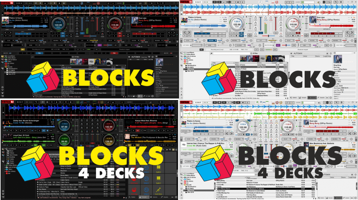
New Update is available.
Blocks ver 3.0

Blocks ver 3.0

- Added 2 & 4 Decks Day (Bright) skin versions, to save your day (gigs) ;)
- Skin variation selection buttons at the top
- Unified top buttons and menus
- Added Record VU meter in Record Block
- Added Mic Eq (low/high) and Mic Talk over in Output Block
- Minor code and graphics fixed
Posted Sat 08 Jun 19 @ 10:01 am
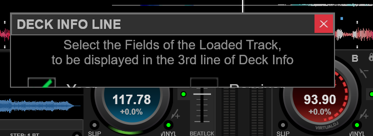
When selecting 'deck info line' from the skin options menu, a box opens up on screen, but the info is cut off and it doesn't seem possible to resize.


Posted Sat 08 Jun 19 @ 10:15 am
I cant do much about that. The issue is that VDJ stores information of floating windows globally inside the same setting, and not per skin. This means that if you load a skin with a window, resize it and then load another skin with a totally different (in dimensions) window, you may end up like your case.
Solution for now, is to delete the content of the skinPosition and skinVisibility settings and restart
Solution for now, is to delete the content of the skinPosition and skinVisibility settings and restart
Posted Sat 08 Jun 19 @ 10:19 am
djdad wrote :
I cant do much about that
Ok I did it myself. I just made the window slightly bigger (in the XML code) than the contents, so the resize works.
Posted Sat 08 Jun 19 @ 10:29 am
Thats not a solution either (editing the XML) - or even a safe workaround - because it may happen again next time you load skins with floating windows.
Posted Sat 08 Jun 19 @ 10:34 am


