


 tayla
tayla
Thank you for the option of the increased image on the sampler, but I'm at a loss as to why you haven't gone full size which would give the individual pads a much better look to them, could someone from the dev team please explain this, thanks.
To anyone that hasn't been able to work out how to get a larger image in the sampler pads you have to enable "all settings" first in the options search bar drop down, then scroll down to the sampler section.
To anyone that hasn't been able to work out how to get a larger image in the sampler pads you have to enable "all settings" first in the options search bar drop down, then scroll down to the sampler section.
Posted Mon 06 Jun 16 @ 4:14 pm
 djdad
djdad
Image size is accessible from the Sampler Options button in the Sampler view of Sideview. Not sure why people need to go into Settings.
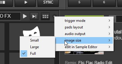
Can you explain what you mean about not having "Full" size image ?
Can you explain what you mean about not having "Full" size image ?
Posted Mon 06 Jun 16 @ 4:26 pm
tayla
Hi Dad, sorry, I didn't know about that route, glad you pointed it out.
Full size image should mean full size image, at the moment although I'm grateful that at last the grid has an improvement, why is there still a few pixels of grey border been locked out of becoming a "full size image". As there is a black border separating individual grids there seems no reason as to why the third option is not "full" in the grid view. It would just look more aesthetically pleasing to the eye.
Full size image should mean full size image, at the moment although I'm grateful that at last the grid has an improvement, why is there still a few pixels of grey border been locked out of becoming a "full size image". As there is a black border separating individual grids there seems no reason as to why the third option is not "full" in the grid view. It would just look more aesthetically pleasing to the eye.
Posted Mon 06 Jun 16 @ 6:05 pm
djdad
Can you post a screenshot ? Perhaps the border is to secure that the playing progress bar is visible , along with the assigned color of the Sample/Group ?
Posted Mon 06 Jun 16 @ 6:25 pm
 PachN
PachN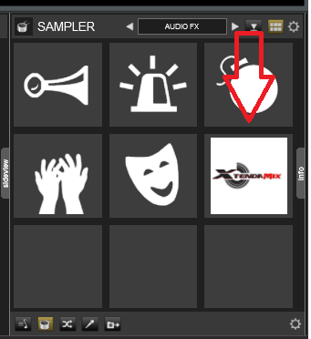
EDIT: No, the progress bar is overlaying the image if necessary.
Posted Mon 06 Jun 16 @ 6:29 pm
djdad
Ok, then the border offers a visual feedback about the playing status of the sample. If no border exists, then it would be hard to tell if the sample is playing or not, in case the image is not a png (transparent)
Posted Mon 06 Jun 16 @ 6:31 pm
 groovindj
I have to agree. If the choices are small, large and full, then what PachN shows should be 'large' and 'full' should be full - to cover the entire pad with no border.
Posted Mon 06 Jun 16 @ 6:33 pm
tayla
Dad, but surely as the progress bar is visible, users can already see that the sample is in operation, so no need for the full image to have a border.
Failing a true full size, what if the border colour was user defined. But a true full size image would look so much better in my opinion.
Failing a true full size, what if the border colour was user defined. But a true full size image would look so much better in my opinion.
Posted Mon 06 Jun 16 @ 7:39 pm
tayla
Like a lot of the other guys I run adverts at different venues, I've asked before I'm sure but pushing it again would it be possible to be able to right click on a sample grid window and have the option to run this as the preferred video for slideshow. The obvious follow on to this would then to be able to select the complete sample bank from the drop down menu.
Again I've asked this one before, how about making the sample drop down window as a slide out with user selectable images to go into the grid window.
These simple improvements would make it so much more user friendly.
Cheers.
Again I've asked this one before, how about making the sample drop down window as a slide out with user selectable images to go into the grid window.
These simple improvements would make it so much more user friendly.
Cheers.
Posted Mon 06 Jun 16 @ 7:53 pm
 SBDJ
SBDJgroovindj wrote :
I have to agree. If the choices are small, large and full, then what PachN shows should be 'large' and 'full' should be full - to cover the entire pad with no border.
The aspect ratio of the button will change, so no image is likely to always perfectly fit a pad, so there is always likely to be a border either horizontally or vertically, as shown by the above image. It would look very odd with different sized buttons, and IMHO it looks better with a slight border all the way around, rather than some odd coloured edges tacked on the ends to make the buttons the correct size and shape.
Posted Mon 06 Jun 16 @ 8:16 pm
SBDJ
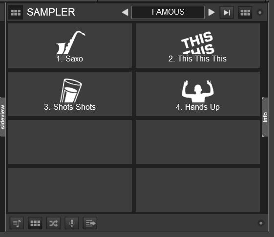
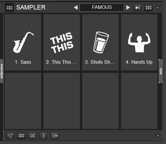
As an example, here is what I mean:
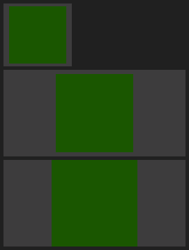
Image 1 is a standard cover on a pad.
Image 2 is the same pad, but resized due to the sizing of the sampler window.
Image 3 is how it would look resized to fill the pad completely.
I actually think image 3 would look a little odd.
Image 1 is a standard cover on a pad.
Image 2 is the same pad, but resized due to the sizing of the sampler window.
Image 3 is how it would look resized to fill the pad completely.
I actually think image 3 would look a little odd.
Posted Mon 06 Jun 16 @ 8:25 pm
tayla
Is it not possible in the code to have it resize to pre determined percentages of the square, as I'd imagine that is how you have set small, large and full... just a thought.
And let the user know what the minimum/maximum size is for images that can be imported.
And let the user know what the minimum/maximum size is for images that can be imported.
Posted Mon 06 Jun 16 @ 8:40 pm
 PhantomDeejay
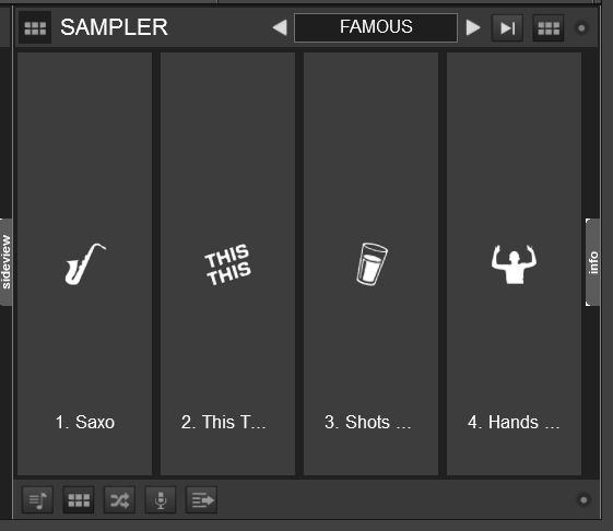
That's the exact same sampler area (no resizing) but with different pad layouts.
Remember that by default on VirtualDj 8 the sampler pad view layout get's calculated automatically depending on the connected controller.
How would you treat those pads (graphic wise) ?
Posted Mon 06 Jun 16 @ 8:47 pm
tayla
I'd would like them as they are described with the choices as they have being given, small, large and full. Full meaning they take up the full square and not have the progress bar sit on top of them, which I assume not being a programmer is why there is a border. Super impose the progress bar over that area of the box if that is possible.
Obviously, choice and actual implementation through coding are two different things as far as the general user is concerned, I don't even know if it is possible to have what I requested, but it would look a lot better than having a grey border. Depending on how many grid squares that are populated full can really only mean large when looking at the grid.
Two other things I would like to see would be...
1. drag and drop to move files about in the grid option
2. save settings in the editor, it's time consuming and a pain in the butt selecting choices every time you load a file into the editor when you know exactly the setting you are going to make.
Posted Mon 06 Jun 16 @ 9:35 pm
SBDJtayla wrote :
I'd would like them as they are described with the choices as they have being given, small, large and full. Full meaning they take up the full square and not have the progress bar sit on top of them, which I assume not being a programmer is why there is a border. Super impose the progress bar over that area of the box if that is possible.
Have you actually tested this feature? The progress bar is already superimposed over the top - and depending on the aspect ratio of the image and the size of the pad the border is tiny as per my already posted screenshots. 6 pixels top and bottom!
The 'full' option will stretch the image (keeping it in the correct aspect ratio) to fill the pad, with no text, an overlaid progress bar and a very small border.
Posted Mon 06 Jun 16 @ 11:42 pm
tayla
Yes, I have actually looked at and tested this feature, I'd be talking out of my arse and looking stupid if I hadn't. I did not know the progress bar was an overlay, I didn't design it, because it takes up space directly above the image in the border area I wrongly assumed this space was allotted to that function, more so now then... why the grey space?
If you take the time to watch the full video you will see that as the grid is reduced so does the "full" image loose it's overall size at certain points, then all of a sudden as the grid reduces further it will snap back to it's "full" size even though the grid area is reducing in overall size. All I asked was why can't the "full" sized image be kept at 100% while it occupies a grid window/space wherever the slide out window is positioned at on the screen.
I honestly never expected a snide comment like that from you Scott, I'd like to think you would have given me a bit more respect than that, I'm posting these questions to find out answers and hopefully make a better experience in using the software, not for me to be a smart arse.
Posted Tue 07 Jun 16 @ 12:43 am
 A Man and His Music
How does this affect the function, or the actual information of the sampler? Do you lose some of the visual? I don't get why this is such a big battle. I use these pads, but I am not spending that much time looking at them. I also have it set so it opens at the same position all the time with my esc key, and am not changing the size of the panel like this. Again, I must be missing something.
Posted Tue 07 Jun 16 @ 2:00 am
djdad
So, from what i understand, you would like the images to be stretched so that they can fill more space inside the pads ?
For the kind of images that your samples have, i guess this wouldnt be an issue for you, but if the images have texts, you realize that it wouldnt look good at all.
As for the "sudden" resize that i noticed in your video, its the moment when VirtualDJ decides that the Sampler view should have a different layout, so that it can fit the information better. This is the expected behavior if you have the Layout to Automatic.
So, bottom line, the only thing that could be added in the future is an option to allow images being stretched. If that is helpful for you or others, then i suppose this belongs to the features requests forum.
Posted Tue 07 Jun 16 @ 2:02 am
SBDJ
It wasn't a snide comment mate - if you set the image to full and have it almost fill the pad as in the above couple of images you can see its already overlaid. Someone else also confirmed that.
I had already explained why it is as it is, even with pictures.
It's why I was puzzled and thought maybe you hadn't played with it fully.
I think allowing deliberate distortion of the images by stretching out of ratio is a bad thing personally.
I had already explained why it is as it is, even with pictures.
It's why I was puzzled and thought maybe you hadn't played with it fully.
I think allowing deliberate distortion of the images by stretching out of ratio is a bad thing personally.
Posted Tue 07 Jun 16 @ 8:05 am
tayla
Ok, thanks for your reply guys, it's down to preference but mine would be to fill those grids to the borders, I hate seeing unoccupied space it looks like something hasn't been finished, if when at "full" it automatically resizes image then why can't the image be made to go to edge.
@Dad, where will I find that setting you mentioned in the sampler, I have the setting in the video config as zoom, is that the same thing for sampler, maybes thats where my problem is.
And lastly not finally, lol, I was hoping to see the select sampler drop down window changed to a grid option, any news if that will be changed, as it is now it needs to be in braille for my eyesight, lol.
Cheers.
Posted Tue 07 Jun 16 @ 1:27 pm